Color from the basic element of art, is the important part of art as other elements of art. As we know we can see things because of light, every object reflects light back and our eyes see one color the color of that object. May be you understand or not the importance of color, the impact of color in our life.
There are different feelings inside every human being and while expressing these feelings on canvas or paper what color you use depicts human psychology of color. In anger, love using more red, using yellow when need to garb attention or caution something, green/blue for calmness etc. this all makes a big difference when creating an artwork, you decide what is your real audiences, what is the purpose of artwork, central point of artwork etc.
Color’s description is understandable 3 parts-
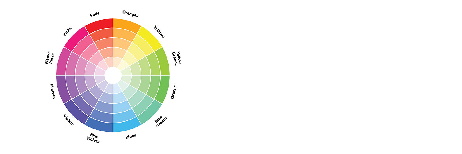
1. Color Wheel-
Red, yellow, blue as primary because they can not be created by mixing other colors. Purple, green, orange secondary colors as they are created by mixing two primary colors together. Intermediate colors or tertiary colors- created by mixing equal parts of secondary color with a primary color. On color wheel mainly sits primary colors and secondary colors, In between there are possible number of intermediary colors.

2. Color value– Color value what we already discussed in last blog, the darkness or brightness of color. and to get lighter value white is added and this is called tint , on other hand adding black to color gives shade. While intensity is adjusted by adding grey to the color.

3. Color schemes- Color schemes are different arrangement sets for artists which they can use in their artworks, Knowledge of such arrangements can help to take decisions about colors in your own artwork. These already built set of color schemes gives easy access to choose from. There are some color schemes you can choose from while creating artwork or design.
– Monochromatic when one color is used with different tint and shades of it is called monochromatic. In monochromatic, increasing or decreasing value can be used in any artwork. While going towards light part by adding white into color give tint and adding black in color is done to get shade of the same color.

– Complementary- Colors on the wheel which are opposite to each other are complementary when used provide high contrast. ex-red-green, orange-blue. In any artwork or design often comes time when you need to decide color combination for your artwork. Often complementary colors are used together to build a better combination but it is not mandatory, its choice of artist or designer.

-Analogous color scheme – Use of 3-5 adjacent colors, it provide harmonious color in drawings and paintings and this way artist get a color and try to maintain the same temperature of color by using 3-5 adjacent colors from color wheel.

– Color Triad- 3 color scheme where 3 colors are in equally distance from each other in color wheel. high level contrast.
– Color Tetrad – 4 color scheme where 4 colors are equally distance on color wheel. created by using 2 sets of complementary colors.


– Cool colors
– Warm colors
