Strategies big e-commerce stores use checkout page: Have you ever done online shopping? You sure did. Are there common design strategies that all most of the successful e-commerce companies are using? Designing a checkout page is not as easy as it looks. It is not all about orders, shipping addresses, payment method boxes etc. It is about maximizing the possibilities to convert a visitor to a successful buyer.
Let’s review some of my favourite one by one and discuss what they have done in their checkout sections to increase the conversion rate.
1: Flipkart
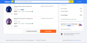
Below is the screenshot of the screen where flipkart takes us once we click on view cart button. Have you noticed anything different than usual flipkart page? Well there are many changes from normal flipkart page to their view cart page. First see the navigation bar. It just left with logo, a search bar and my account name. All other navigation items are abandoned. Same they did with the footer section, they took all the massive footer information out, even their 3 column footer too. Only thing at the bottom is thin footer section.
Why they did so?
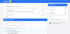
Let’s take another step and when we place the order and flipkart take us to the below screen.
In this page they went one step further and removed the search bar and even my account menu as well. And there is something at the price details side at the bottom that says “Safe and secure payments, Easy Returns, 100 % Authentic products”. What exactly that for? By this far you might be getting ideas in your head. Lets see other 2 e-commerce platform.
2: Amazon
I am not going to repeat all things again as all the ecommerce use common strategies for checkout process. Below are the screenshots for the amazon(view cart and Checkout).
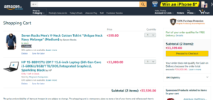
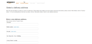
See these two above screenshots closely. Aren’t you start seeing common things/concept between flipkart and amazon now? For more let see one more from Myntra.
3: Myntra
Finally the simple clothing store which is my favorite, Myntra.
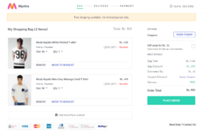
Now we are done with all the checkout pages for Flipkart, Amazon and Myntra and till now you might have some points in your mind that you can use for designing checkout pages. Here is summery of all the blog. Ecommerce websites uses these concepts to increase conversion rate.
- Minimize the number of components to be used in a checkout page. Use only those which are necessary. Giving more options and menus can distract a buyer while doing final checkout. That’s why all 3 have used minimal components in their checkout pags. As flipkart took out their search and Account information icon too. Amazon don’t use header and footer while checkout process and the same approach is used by myntra as well.
- The second thing to keep in mind to put something that build trust in buyer’s mind and give them a little push to hit the make payment button. The images on right corner or at the bottom saying “100% authentic products”, “Secure payments”, “Products through certified sellers” etc. these are used to gain trust of buyer. As a buyer become very confuse before actually making the payments and these little things make him/her feel that he is making right choice.
- The third thing is that is important because an every person in today’s life want more done in some click. Than why not make a successful checkout in one step. Flipkart uses this concept and it takes all the data that includes Shipping information, payment information in same page while checking out and after this page click the button and you are good to go. Mission accomplished. While amazon and myntra uses step by step checkout process that is, first taking the delivery address details than payment options in next step. While amazon also make it lengthy by adding a step for shipping details where you can select shipping options. But they are big brands now and many of us find it worth clicking it multiple times to buy from them.
- Others are some common design aspects like using high contrast color for depicting the place order, make payment button while using the light grey and dull color for those which you want to avoid getting clicked (like delete item).
I think that is all, the simple strategies used by e-commerce stores to increase the conversion rates from a visitor to successful buyer. Make use of them in your design next time when you will design an e-commerce website. Suggest points in comment section which i missed.

